Ever cracked open an eBook only to be met with an eye-straining font that made you want to throw your device across the room? Yeah, we’ve all been there. As an author or publisher, your eBook’s font isn’t just about aesthetics—it’s about creating a smooth and enjoyable reading experience for your audience.
So, how do you pick the right one? Let’s dive in and explore the world of eBook fonts, making sure your readers keep turning those virtual pages.
Font Choice: The Unsung Hero of Reading Enjoyment
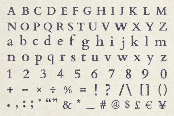
Picture this: you’ve poured your heart and soul into writing an incredible story, crafting insightful non-fiction, or compiling a valuable resource. But then… you slap on a default font and hit publish. It’s like serving a gourmet meal on a paper plate – the presentation just doesn’t do justice to the content.
Read more: Ultimate eBook Launch Checklist
Here’s how the right font elevates your eBook:
Readability, the Cornerstone of Engagement:
- Eye Strain & Fatigue: A font that’s too small, ornate, or tightly spaced can lead to eye strain and fatigue, making readers abandon your book before they even get into the good stuff.
- Flow & Comprehension: Well-chosen fonts guide the reader’s eye smoothly across the page, aiding comprehension and immersion in your work.
- Adapting to Devices: Different devices have different screen sizes and resolutions. A font that looks great on a tablet might be hard to read on a phone. Choosing a versatile font ensures a pleasant reading experience across all platforms.
Professionalism: Making a Lasting Impression:
- Credibility & Trust: A polished and professional font choice signals to readers that you’re serious about your work and invested in their experience.
- Genre Alignment: Certain fonts have strong associations with specific genres. A classic serif font might be perfect for a historical romance, while a modern sans-serif could suit a tech thriller.
Mood & Tone: Evoking Emotions and Setting the Stage:
- Personality: Fonts have distinct personalities – elegant, playful, serious, quirky. The right font can amplify your writing’s voice and resonate with your target audience.
- Atmosphere: Fonts can create a subtle atmosphere. A handwritten font can feel intimate and personal, while a bold, condensed font might add a sense of urgency or excitement.
Accessibility: Inclusivity at Its Finest:
- Visual Impairments: People with dyslexia or other visual impairments often benefit from specific font characteristics like clear letterforms and generous spacing.
- Aging Eyes: Older readers may find it easier to read fonts with larger x-heights (the height of lowercase letters) and ample contrast.
Think of your font choice as the soundtrack to a movie – it sets the mood, enhances the story, and subtly guides the viewer’s emotions. The wrong font can create dissonance and distract from the main event, while the right one can elevate your eBook to a whole new level.
What Font is Best eBook? Serif vs. Sans Serif
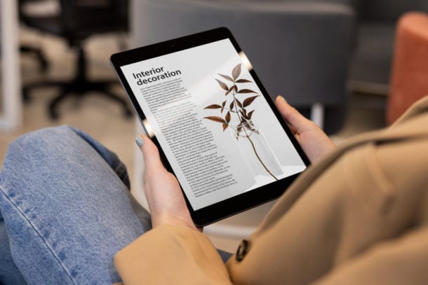
Alright, so we know font choice is important, but which fonts are actually good for eBooks? Generally, you’ll want to stick with two main categories:
Serif Fonts: Think of these as the fonts with little “feet” or “tails” at the ends of the letters (like Times New Roman or Garamond). Serifs are often seen as more traditional and can be great for long blocks of text, as those little feet help guide the eye along the line.
- Pros: Easy on the eyes for long reads, classic and elegant look, good for genres like fiction, history, and biography.
- Cons: Might look a bit dated or stuffy for some genres, serifs can get lost on smaller screens.
Examples of Good Serif eBook Fonts:
- Georgia: A classic choice, highly readable on screens.
- Bookerly: Designed specifically for Amazon Kindle, a great all-around option.
- Literata: A newer serif font that’s both elegant and legible.
Sans Serif Fonts: These fonts lack the serifs, giving them a clean and modern look (think Arial or Helvetica). They can be a bit more attention-grabbing and are often used for headings and shorter passages of text.
- Pros: Clean and modern, great for genres like non-fiction, tech, and design, very readable on screens.
- Cons: Can feel a bit cold or impersonal for some genres, not always the best for long blocks of text.
Examples of Good Sans Serif eBook Fonts:
- Lato: A versatile sans serif that’s both friendly and professional.
- Open Sans: Another popular choice, known for its clarity and readability.
- Avenir: A more stylish sans serif, good for a modern or minimalist aesthetic.
Serif Fonts Example
The quick brown fox jumps over the lazy dog. This is Georgia, a classic serif font known for its readability and elegance. It’s a popular choice for body text in both print and digital publications.
The five boxing wizards jump quickly. This is Bookerly, a serif font designed specifically for Amazon Kindle. It’s optimized for digital reading and offers a comfortable reading experience on e-readers.
Jived fox nymph grabs quick waltz. This is Literata, a modern serif font designed for both screen and print. It has a clean and elegant appearance, making it suitable for a variety of purposes.
Sans Serif Fonts Example
The quick brown fox jumps over the lazy dog. This is Lato, a versatile sans-serif font with a warm and friendly feel. It’s highly legible and works well for both body text and headings.
The five boxing wizards jump quickly. This is Open Sans, a popular sans-serif font known for its neutrality and readability. It’s widely used in web design and digital publications.
Jived fox nymph grabs quick waltz. This is Avenir, a geometric sans-serif font with a modern and stylish look. It’s often used for headlines and logos but can also work for body text.
Finding the Perfect Fit: Tailoring Your Font to Your eBook
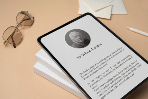
Okay, we’ve covered the basics of serif and sans serif fonts, but how do you decide which one is right for your eBook? It’s time to match your font to your specific needs and audience.
Genre plays a significant role in font selection. For fiction, especially literary fiction, historical fiction, and romance, serif fonts like Garamond or Bookerly are often preferred. They evoke a sense of tradition and can create a more immersive reading experience. On the other hand, non-fiction genres like self-help, business, and technology tend to favor sans serif fonts like Lato or Open Sans. Their clean lines and modern look convey clarity and professionalism. For children’s books, the focus is on playfulness and readability. Whether you choose a serif or sans serif, consider rounded letterforms and larger sizes for young readers.
Understanding your audience is key. Older readers might appreciate a slightly larger font size or a font with wider spacing. Consider the interests of your audience. If they’re tech-savvy, a modern sans serif might appeal to them, while fans of classic literature might prefer a traditional serif. If your audience includes readers with dyslexia, using a dyslexia-friendly font like OpenDyslexic can make a huge difference in their reading experience.
The tone of your eBook should also inform your font choice. For serious and formal works, classic serif fonts like Garamond or clean sans serifs like Helvetica are a safe bet. Lighthearted and fun content can be enhanced with handwritten fonts or whimsical sans serifs like Comic Sans (used sparingly!). If you’re aiming for a modern and minimalist aesthetic, sleek sans serifs like Avenir or Lato are excellent choices.
Remember, there are no hard and fast rules. Don’t hesitate to experiment with different fonts and see what feels right for your eBook. Create sample pages with various options and get feedback from friends, family, or beta readers.
Here are some additional factors to keep in mind:
- Font Size: Aim for 10 to 12 points for comfortable reading on most devices.
- Line Spacing: A line spacing of 1.5 or 1.6 generally provides a pleasant reading flow.
- Font Weight: Avoid using extremely light or bold fonts for the main body text. Stick with regular or medium weights.
Read more on How to Structure an eBook
Conclusion
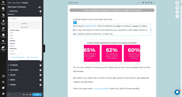
Ultimately, the perfect eBook font is the one that best suits your unique book, genre, and audience. It’s about finding that sweet spot where readability, professionalism, mood, and accessibility harmoniously converge. With a little experimentation and thoughtful consideration, you can create an eBook that not only looks great but also provides an enjoyable and engaging reading experience for everyone.
Choosing the right font is just one piece of the eBook design puzzle. If you’re looking for a way to create stunning eBooks without the hassle, consider using an eBook designer, like Designrr. Their easy-to-use platform handles everything from layout to formatting, allowing you to focus on your content. Plus, their built-in font recommendations can help you find the perfect typeface for your project.
Reduce your eBook workload – click to unlock Designrr’s special offer and get your book out faster and choose the font that works for you and your reader!
