You’re spending money to get people to your website. But how many of them actually buy something or fill out your form? If you’re like most businesses, it’s somewhere between 2% and 4%. That means 96 to 98 out of every 100 visitors leave without doing anything.
That’s a lot of wasted traffic.
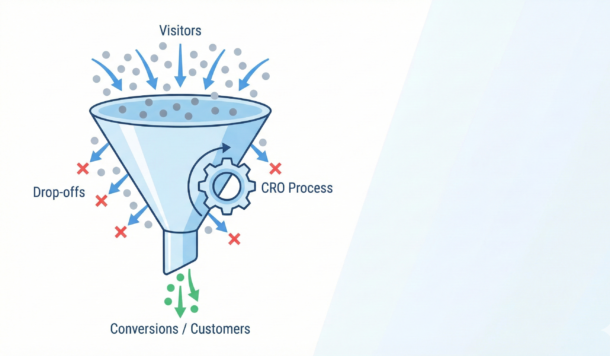
Conversion rate optimization is how you fix that. It’s the process of figuring out why people aren’t converting on your site and then removing whatever’s getting in their way. When you do it well, you get more customers from the traffic you already have. No extra ad spend required.
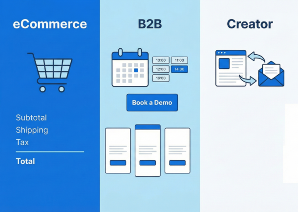
This guide walks you through everything you need to know. Whether you’re running an eCommerce store, a B2B company, or building an audience as a creator, you’ll find strategies you can use right now.
What Is Conversion Rate Optimization?
A conversion happens when someone does what you want them to do on your website. For an eCommerce store, that’s usually a purchase. For a B2B company, it might be booking a demo. For a creator, it could be joining your email list.
Your conversion rate is just the percentage of visitors who take that action. If 1,000 people visit your site and 30 buy something, your conversion rate is 3%.
So what does it actually mean to optimize that rate? It means looking at your data, figuring out where people drop off, testing changes, and measuring results. It’s not guessing. It’s not randomly changing button colors. It’s a systematic process.
Here’s why this matters to you right now. Let’s say you’re converting at 2%. If you can get that to 4%, you’ve doubled your results without spending another dollar on ads. Same traffic, twice the revenue. That’s the power of CRO.
What’s a Good Conversion Rate?
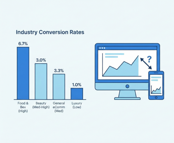
Before you start optimizing, you need to know where you stand. Here’s what typical conversion rates look like across different business types:
| Industry | Typical Conversion Rate |
| Food & Beverage | 4.9% – 7% |
| Beauty & Personal Care | 4.5% – 6% |
| Arts & Crafts | 4% – 5.8% |
| General eCommerce Average | 2.5% – 3% |
| Luxury & Jewelry | 1% – 2% |
Source: Blend Commerce benchmarks
Notice the range. Food and beverage converts way higher than luxury goods. Why? Because buying a $15 snack is a quick decision. Buying a $5,000 watch takes time. Your industry affects what “good” looks like for you.
For B2B, rates typically fall between 1.8% and 2.7%, according to industry research. That’s lower than B2C, but the deal sizes are usually much bigger.
What about Amazon? They convert at 10% to 15%. But they’ve spent billions making checkout completely frictionless. One click and you’re done. That’s the benchmark, not the starting point.
The Mobile Problem You Need to Fix
Here’s something that should concern you. Mobile drives 70% to 80% of your traffic. But mobile conversion rates are only 2% to 3%, compared to desktop’s 3.5% to 4.8%.
Think about what that means. People are browsing on their phones. They’re adding things to cart. But when it comes time to check out, something stops them.
Is your checkout too complicated on mobile? Are your forms hard to fill out? Is your site too slow? These are the questions you should be asking about your own site right now.
What’s Changed in Conversion Optimization
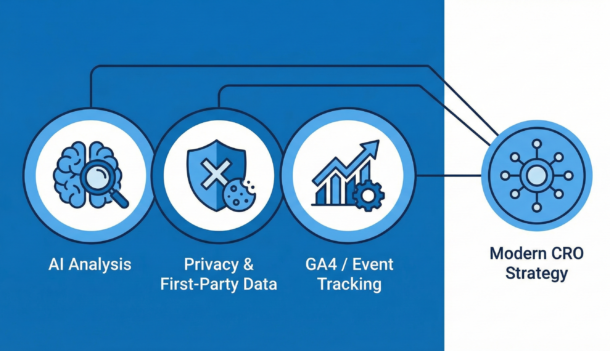
If you learned CRO a few years ago, some of what you know is outdated. Four big shifts have happened that affect how you should approach optimization today.
AI Is No Longer Optional
AI tools now analyze visitor behavior in real time. They track where people scroll, where they hesitate, and where they drop off. They spot patterns you’d never catch manually.
But here’s the bigger change. Traditional A/B testing splits traffic evenly and waits weeks for results. AI-powered testing shifts traffic toward winning variations automatically. Research shows this can find winners in days instead of weeks.
What does this mean for you? If you’re still running month-long A/B tests, you’re leaving money on the table.
Tracking Has Gotten Harder
Safari and Firefox block third-party cookies. That’s 30% to 40% of web traffic where your old tracking doesn’t work anymore. Chrome is heading the same direction eventually.
The companies winning right now are collecting first-party data directly from customers. They’re using quizzes, preference centers, and loyalty programs to get information people willingly share. According to Marketing Insider, this approach is driving real revenue lift.
Are you still relying on third-party data? That’s a problem you need to address now, not later.
Email Open Rates Are Meaningless
Apple Mail now pre-loads tracking pixels automatically. Since Apple accounts for about half of email opens, your open rate numbers are inflated and unreliable.
Click-through rate is the metric that matters now. It shows who actually engaged with your email, not whose mail app happened to load a pixel.
Google Analytics Changed Completely
Universal Analytics is gone. GA4 works differently. It uses events instead of sessions, and it requires manual setup for conversion tracking. If you haven’t configured it properly, you might be missing critical data about how people use your site.
How to Optimize Your Landing Pages
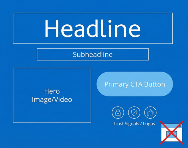
Your landing page is where conversions happen or don’t. Visitors decide in seconds whether to stay or leave. And research from Demand Curve shows that most of their attention goes to what they see before scrolling.
So what needs to be above the fold on your page?
| Element | Why It Matters |
| Clear headline | Tells visitors exactly what you offer and why they should care. Keep it under 10 words. |
| Subheadline | Explains how you deliver on the headline’s promise. |
| Primary CTA | Visible without scrolling. People who have to hunt for your button often don’t. |
| Hero image or video | Shows your product in use or demonstrates results. Skip the generic stock photos. |
| Trust signals | Client logos, ratings, or a testimonial. Builds credibility before they read further. |
Look at your own landing page right now. Is your main call-to-action visible without scrolling? If not, that’s your first fix.
Common Mistakes That Kill Conversions
Some patterns destroy conversion rates reliably:
Autoplay carousels. Multiple messages competing for attention confuse people. Pick one message and commit to it.
Immediate pop-ups. Interrupting visitors before they’ve seen your page is annoying. Wait until they’ve scrolled or are about to leave.
Multiple CTAs. “Buy Now” next to “Learn More” next to “Contact Us” creates decision paralysis. One clear action beats three unclear ones.
False bottoms. If your above-the-fold section looks complete, people won’t scroll to see more. Make it obvious there’s content below.
Track all the important landing page metrics.
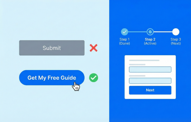
Writing CTAs That Work
Your call-to-action button is where conversions happen. Get it wrong and everything else you’ve done is wasted.
Use colors that stand out from your background. Make buttons at least 48 pixels tall on mobile so they’re easy to tap. And write copy that combines action with benefit.
“Get My Free Guide” works better than “Submit.” “Start My Trial” beats “Learn More.” The button should tell people what they’ll get, not just what they’ll do.
Add microcopy near your button that handles objections. “No credit card required” or “Cancel anytime” reduces the risk people feel about clicking.
Form Optimization: Stop Losing Leads Here
Forms are where you lose a lot of potential customers. Someone wants what you’re offering, but your form is too long or too confusing or too annoying, and they give up.
Here’s what actually works:
Break Long Forms Into Steps
Multi-step forms outperform single-page forms by a huge margin. Case studies show completion rates jumping from around 10% to over 50% just by breaking forms into logical chunks.
Why does this work? When someone completes a step, they feel invested. They’ve already put in effort, so they’re more likely to finish. It’s basic psychology.
Keep each step focused on one thing. Start with easy questions like name and email. Save sensitive stuff like payment info for later. Aim for 3 to 5 fields per step.
Show Progress
Never leave people wondering how much more they have to fill out. Use a progress bar or step counter. “Step 2 of 3” is way less intimidating than a wall of fields.
Labels like “Contact Info” work better than “Step 1” because they tell people what to expect.
Validate In Real Time
Nothing frustrates people more than filling out an entire form, hitting submit, and seeing error messages that make them start over. Show errors as they happen, not after.
And when you show an error, be specific. “Please enter a valid email” helps. “Invalid input” doesn’t.
Mobile Optimization: Close the Gap
Remember that stat about mobile converting at half the rate of desktop? Here’s how to fix it.
Speed Is Everything
Mobile users expect your page to load in 2 seconds or less. Every second after that increases the chance they’ll leave. The classic Walmart study showed a 2% conversion increase for every 1-second improvement in load time.
Where do you start? Images are usually the biggest culprit. Compress them. Use lazy loading for content below the fold. Cut unnecessary scripts.
Design for Thumbs
Most people use their phones one-handed. Your buttons need to be at least 48 pixels tall so they’re easy to tap. Put important elements in the bottom center of the screen where thumbs can reach them easily.
Use single-column layouts. Add space between clickable elements so people don’t tap the wrong thing by accident.
Fix Your Mobile Checkout
Mobile cart abandonment rates hit 80% to 85%, according to cart abandonment research. That’s brutal. But it means there’s huge opportunity.
Offer guest checkout. Requiring account creation kills conversions. Integrate Apple Pay and Google Pay for one-tap purchasing. Show a progress indicator so people know how many steps are left.
Pull up your own site on your phone right now. Try to complete a purchase. Where do you get frustrated? That’s where your customers are getting frustrated too.
Social Proof That Actually Works
People look to others when making decisions. It’s human nature. The question is how you use that on your site.
Reviews and Ratings
Over 90% of consumers read reviews before buying. And here’s something interesting: products with 4.2 to 4.5 stars actually convert better than perfect 5-star products. Why? Because perfect ratings look fake. A few negative reviews handled well build more trust than a wall of praise.
Third-party platforms like Google Reviews, G2, and Yelp carry more weight than testimonials on your own site. They’re harder to fake, and people know it.
Real-Time Activity
“Maria from Dallas just bought this” notifications work when they’re real. Booking.com built their whole experience around this kind of social proof.
But fake activity notifications backfire badly. People notice when “Sarah from New York” apparently buys the same thing every 30 seconds. That destroys trust faster than it builds it.
Video Testimonials
Video testimonials outperform written ones significantly. They’re harder to fake, they create emotional connection, and they let prospects see real people talking about real results. If you can get customers on camera, use that content prominently.
Urgency and Scarcity: What Works and What Doesn’t
Countdown timers and “only 3 left” messages can boost conversions. But consumers have gotten smarter about spotting manipulation.
What Still Works
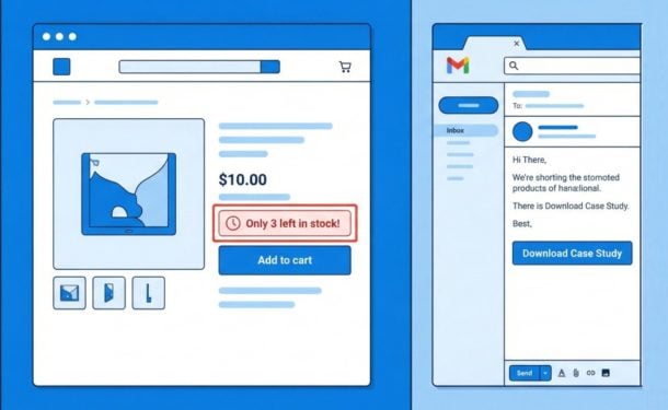
Real stock counts. “Only 3 left in stock” works when it’s true. When your inventory actually runs out, that’s authentic scarcity.
Genuine deadlines. Sales that actually end, seasonal products that actually go away, limited-time bonuses that actually expire.
Activity-based urgency. “12 people bought this in the last hour” combines scarcity with social proof. It works when it’s real.
What’s Backfiring
Fake countdown timers. If your timer resets when people refresh the page, they’ll notice. And they’ll lose trust in everything else on your site.
Permanent “limited time” offers. If your sale has been running for six months, it’s not limited time. You’re just training people to ignore your messaging.
Artificial scarcity. “Only 2 left” for a digital product that has unlimited inventory insults your customers’ intelligence.
Research found that “feeling manipulated” was a major reason people didn’t convert. When urgency tactics feel fake, they do more harm than good.
Email Optimization That Works Now
Remember, open rates are unreliable now. Focus on clicks instead.
One CTA Per Email
Research shows single-CTA emails dramatically outperform those with multiple options. Every additional link you add is another decision for your reader to make, and that costs you clicks.
Use a button, not a text link. Make it big enough to tap on mobile. And write specific action copy like “Download the Case Study” instead of vague “Learn More.”
Triggered Emails Beat Newsletters
Welcome sequences, abandoned cart emails, and purchase follow-ups consistently outperform batch newsletters. They’re sent based on what someone actually did, so they’re relevant.
Abandoned cart emails are especially powerful. Send one within 1 to 3 hours of abandonment, follow up the next day, and send a third at 48 hours with an incentive. This sequence recovers sales you’d otherwise lose.
eCommerce-Specific Strategies
Why People Abandon Carts
About 70% of carts get abandoned. But once you understand why, you can fix it.
| Reason | How to Fix It |
| Unexpected costs (shipping, taxes) | Show total cost upfront, before checkout |
| Forced account creation | Offer guest checkout |
| Security concerns | Add trust badges near payment fields |
| Complicated checkout | Use single-page checkout when possible |
Source: Omnisend cart abandonment research
Product Pages That Convert
Most buyers say images are the biggest factor in their purchase decision. So give them 5 to 7 high-quality photos from different angles. Add zoom. Include lifestyle shots showing the product in use. User-generated photos from real customers add authenticity that studio shots can’t match.
B2B-Specific Strategies
B2B works differently. Longer sales cycles, multiple decision-makers, bigger purchases. Your optimization strategy needs to account for that.
Pricing Transparency
Should you show your pricing? Research says yes. Pages with visible pricing consistently outperform those that hide it behind “Contact Us.”
Use a three-tier structure. It simplifies the decision. Put plans in order from highest to lowest price for anchoring. And highlight your “most popular” option.
Demo Requests
Speed matters here. Contacting leads within 5 minutes dramatically increases your chances of qualifying them. Embed scheduling directly on your page so there’s no back-and-forth over email.
Keep your form short. 5 to 7 fields maximum. Put customer logos and case studies near your booking button to build credibility right when they’re deciding.
Content Creator Strategies
Creators face different challenges. You’re building an audience, selling courses, growing a newsletter. Here’s what works.
Newsletter Signups
“Subscribe for updates” converts terribly. It’s vague and boring. Instead, give your newsletter a name, explain what people will get, and show how often you send it.
Content upgrades work well. That’s a relevant bonus you offer within a blog post in exchange for an email. Because it’s directly related to what someone’s already reading, conversion rates are much higher than generic signup boxes.
Sign up for Designrr’s special offer today!
Lead Magnets
Research shows short-form content outperforms long ebooks. Templates and tools that people can actually use beat generic guides. Video lead magnets convert especially well.
The key is solving one specific problem. “5 tips for everything” doesn’t work. “The exact template I use to X” does.
The Psychology Behind Conversions
Understanding why people make decisions helps you influence those decisions. Here are the principles that matter most.
| Principle | What It Means | How to Use It |
| Loss Aversion | Losses feel twice as painful as equivalent gains | Frame benefits as avoiding loss. “Stop losing $1,000/year” beats “Save $1,000/year” |
| Social Proof | People follow what others do, especially when uncertain | Show reviews, testimonials, and customer counts near your CTA |
| Scarcity | Limited availability increases perceived value | Show real stock levels or genuine deadlines |
| Anchoring | First numbers influence all later judgments | Show original price crossed out next to sale price |
| Choice Paradox | Too many options leads to no decision | Limit options. Three pricing tiers beats four |
These principles are timeless. The tactics change, but the psychology doesn’t.
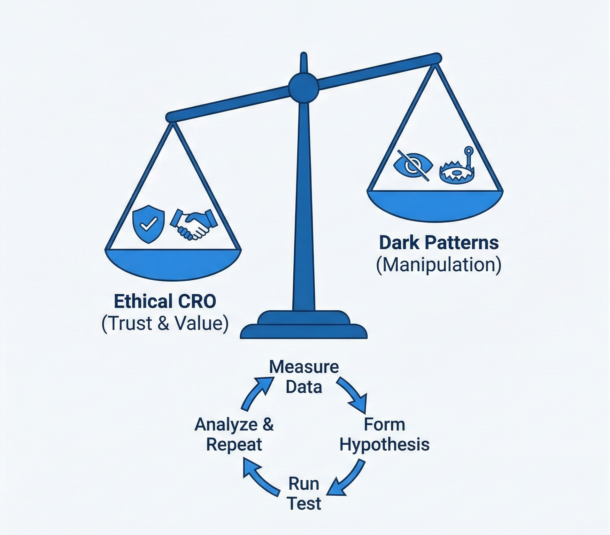
Ethical Optimization and Dark Patterns
Here’s the thing. Manipulation works in the short term. But it destroys trust and invites regulation.
Amazon paid $2.5 billion in 2025 for making Prime subscriptions easy to start and hard to cancel. The EU’s Digital Services Act explicitly bans dark patterns. This isn’t abstract risk anymore.
Patterns to Avoid
Roach motels. Easy signup, impossible cancellation. If someone has to call a phone number to cancel, you’re doing this.
Confirm-shaming. “No thanks, I don’t want to grow my business.” This doesn’t persuade. It just annoys people.
Hidden auto-renewals. If people don’t know they’re signing up for recurring charges, expect chargebacks and complaints.
Pre-checked boxes. Opting people into things they didn’t ask for violates regulations in many places and erodes trust everywhere.
What Works Instead
Spotify made cancellation one tap. Retention actually went up. Patagonia simplified their cart by removing upsell tricks. Sales increased. Ethical design isn’t just safer legally. It often performs better.
Your Action Plan
That’s a lot of information. Here’s how to prioritize what to work on first.
- Fix your measurement. If your analytics aren’t set up right, you’re guessing. Make sure you can actually see where people drop off.
- Find your biggest leak. Where in your funnel do you lose the most people? That’s where to focus first.
- Start with quick wins. Above-the-fold CTA placement, form simplification, mobile checkout fixes. These often deliver big results with modest effort.
- Build first-party data collection. Quizzes, preference centers, value exchanges. This matters more every year as third-party tracking dies.
- Test systematically. Make hypotheses based on data. Run tests. Measure results. Repeat. CRO isn’t a project with an end date. It’s an ongoing practice.
The average conversion rate is 2% to 4%. Top performers hit much higher. The difference is methodology, not magic. Start measuring, start testing, and keep improving.
Your traffic is already coming. The question is how much of it you’re going to convert.
Frequently Asked Questions About Conversion Rate Optimization
Get answers to the most common questions about improving your website’s conversion rate
What is conversion rate optimization (CRO)?
Conversion rate optimization is the process of figuring out why visitors aren’t converting on your website and then removing whatever’s getting in their way. It involves analyzing your data, identifying where people drop off, testing changes, and measuring results. When done well, CRO helps you get more customers from the traffic you already have—without spending more on advertising.
What is a good conversion rate for my website?
Good conversion rates vary significantly by industry. Food and beverage sites typically see 4.9% to 7%, beauty and personal care around 4.5% to 6%, while general eCommerce averages 2.5% to 3%. Luxury goods often convert at just 1% to 2% due to longer decision cycles. For B2B, rates typically fall between 1.8% and 2.7%. Your industry and product price point heavily influence what “good” means for your business.
Why is my mobile conversion rate so much lower than desktop?
Mobile drives 70% to 80% of traffic but converts at only 2% to 3%, compared to desktop’s 3.5% to 4.8%. Common culprits include complicated checkout processes, forms that are hard to fill out on small screens, slow page load times, and buttons that are too small to tap easily. Mobile cart abandonment rates hit 80% to 85%, making mobile checkout optimization a critical priority for most businesses.
What should be above the fold on my landing page?
Your above-the-fold area should include five key elements: a clear headline (under 10 words) that tells visitors exactly what you offer, a subheadline explaining how you deliver on that promise, a visible primary call-to-action button, a hero image or video showing your product in use, and trust signals like client logos or ratings. If visitors have to scroll to find your main CTA, that’s your first fix.
How can I reduce form abandonment?
Break long forms into multiple steps—this can increase completion rates from around 10% to over 50%. Start with easy questions like name and email, save sensitive information for later, and aim for 3 to 5 fields per step. Always show a progress indicator so people know how much remains. Use real-time validation to catch errors as they happen rather than after submission.
What’s the best way to write call-to-action buttons?
Use colors that contrast with your background and make buttons at least 48 pixels tall on mobile. Write copy that combines action with benefit—”Get My Free Guide” outperforms “Submit,” and “Start My Trial” beats “Learn More.” Add microcopy near your button to handle objections, such as “No credit card required” or “Cancel anytime,” which reduces the perceived risk of clicking.
Why do people abandon their shopping carts?
About 70% of carts get abandoned. The main reasons include unexpected costs like shipping and taxes appearing at checkout, being forced to create an account, security concerns about payment, and overly complicated checkout processes. To fix these issues, show total costs upfront, offer guest checkout, add trust badges near payment fields, and simplify your checkout flow.
Do countdown timers and scarcity tactics still work?
Real scarcity works; fake scarcity backfires. Genuine stock counts, actual sale deadlines, and real-time activity indicators (“12 people bought this in the last hour”) can boost conversions when they’re authentic. However, countdown timers that reset on page refresh, permanent “limited time” offers, and artificial scarcity for unlimited digital products destroy trust. Research shows that “feeling manipulated” is a major reason people don’t convert.
What type of social proof works best?
Products with 4.2 to 4.5 star ratings actually convert better than perfect 5-star products because perfect ratings look fake. Third-party platforms like Google Reviews carry more weight than testimonials on your own site. Video testimonials significantly outperform written ones because they’re harder to fake and create emotional connection. Real-time activity notifications work when authentic, but fake ones destroy trust quickly.
How has tracking and analytics changed for CRO?
Several major shifts have occurred. Safari and Firefox now block third-party cookies (affecting 30% to 40% of traffic), making first-party data collection essential. Apple Mail pre-loads tracking pixels, making email open rates unreliable—focus on click-through rates instead. Google Analytics 4 requires manual setup for conversion tracking and uses events instead of sessions. AI-powered testing can now find winning variations in days instead of weeks.